- 27 Posts
- 21 Comments
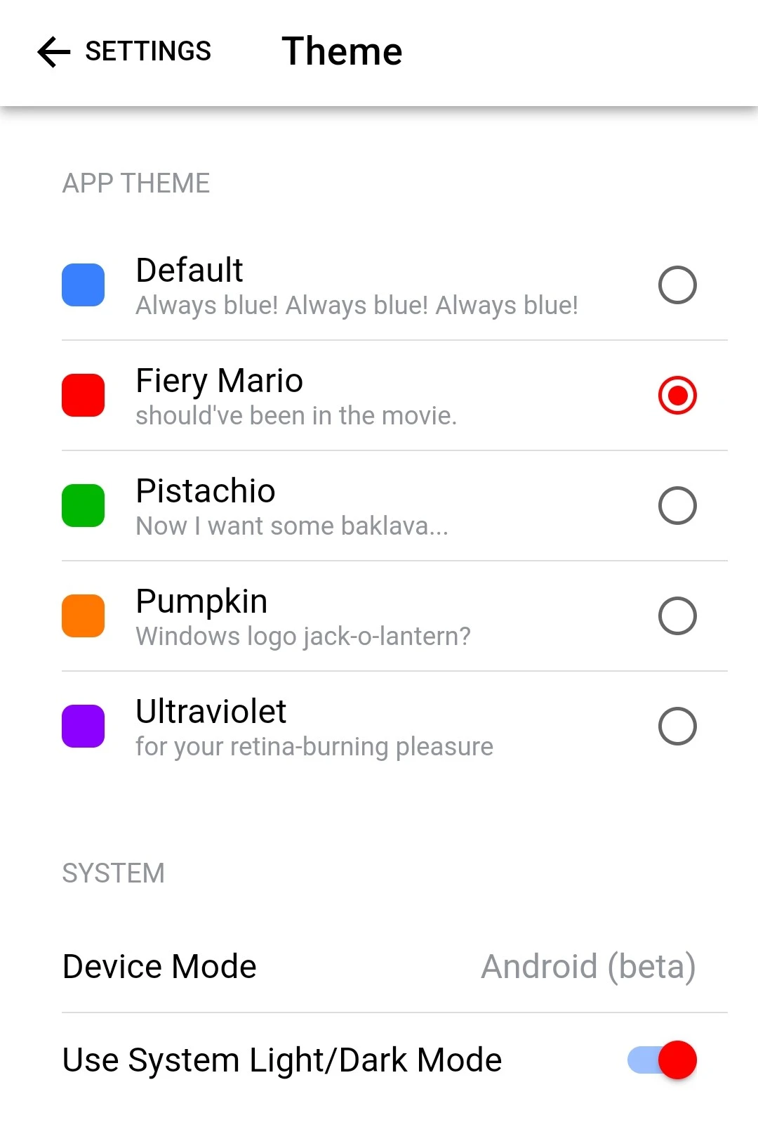
Here is a screenshot.

Woah! That was quick!
I have a problem. It’s not really to native app though. It’s related to themes. Themes look good in Apple mode, but in Android mode switches look half blue half red. It looks weird.

 2·1 year ago
It happens sometimes on Hermit also.

 5·1 year ago
Glad to see you’re planning to launch it on Play Store as well.

 14·1 year ago
It is an Instance.
Lemmy.world also hosts Voyager at https://m.lemmy.world and MLMYM at https://old.lemmy.world

 3·1 year ago
My biggest problem with the webapp is that it fills my Chrome history, so it basically becomes useless.

 1·1 year ago
I tried, but it doesn’t work as well. Has problems with scrolling etc.

 1·1 year ago
I’m not getting it.

 2·1 year ago
It works, but there are two problems:
- I will have to remember this.
- It also activates Chrome’s long press action (Menu bar), so I’ve to close that first.
List all the subreddits it can find. Put checkboxes in front of all of them. Put a subscribe button in top right corner.

 1·1 year ago
It was made for tablets in Android 3.0 Honeycomb.
I don’t know about others but MIUI (Xiaomi/Poco) have an option to disable it.

 1·1 year ago
Switching between apps might be bit slower, however going back is much faster and is more used. So I find it faster overall. And feels much easier after the initial learning part.

 2·1 year ago
I think it was part of Tablet UI for Android 3.0 Honeycomb.

 2·1 year ago
I feel the same, that’s why I turned it off.

 1·1 year ago
There is an option in MIUI to swipe down on left side for notifications and right side for Control Center.

 4·1 year ago
Yes. AFAIK it’s just a copy of iPhone feature.
Not all the people are devs. They wouldn’t have any idea which feature would be easy to do and which wouldn’t.

 7·1 year ago
Nah, I don’t like it. Vivo Oppo phones do it and it’s very confusing for me.

Voyager is pretty good, but it has a lot of missing features. Not only that but it doesn’t behave as well as a native app, because it isn’t. It’s pretty smooth for a PWA, but still no match for a native app.