1st Assistant Camera and occasional Director of Photography. I work on movies, commercials, music videos and more.

Los Angeles, California

  • 48 Posts
  • 4 Comments
Joined 1 year ago
cake
Cake day: June 15th, 2023

help-circle


  • Some interesting quotes from the article:

    Asked about the unused light on the bus ceiling, Lubezki says, “Sometimes you panic because you’re used to doing things in a certain way. I’m a feature-film cinematographer, and I haven’t done documentaries in a while, so my instincts are to always try to make the image appealing. It took me a long time to go back to basics and say, ‘No, I don’t want this movie to look conventionally beautiful.’ This is a movie I couldn’t have done when I was younger. I don’t know if I’m going on the right path. The more I learn, the less lighting I want to do.” With a chuckle, he adds, “Maybe I’m getting lazy!”

    Shot entirely handheld with very little traditional film lighting, Children of Men has a visual aesthetic that borders on documentary. Lubezki recalls that the genesis of this look started with a decision to avoid standard shot breakdowns. He explains that he and Cuarón have an aversion to traditional coverage, with “A-B-A-B” intercutting of opposing shots of two actors. “We decided to have every shot be a shot in itself and avoid the A-B-A-B of coverage, even though we couldn’t get away from doing it sometimes. The more I work this way, the more I realize that conventional coverage is what makes most movies feel the same. You go to see a comedy, a drama, or a horror movie, and they all somehow feel the same. It’s as if the cinematic language hasn’t really evolved that much. Many films just cover the dialogue without really exploring the visual dimension.”

    One of the key decisions Lubezki made early on was to shoot Children of Men with as few movie lights as possible. “I didn’t want to light the movie, or at least I didn’t want it to feel lit. I want the viewer to feel as though the action is happening for real. I didn’t want to make anything pretty or beautiful unnecessarily. For example, I didn’t want to put a backlight on an actor [for beauty reasons]. Of course, I couldn’t get away with not lighting at all. When winter came, the locations we were using between buildings started getting dark very early, so some of our locations had to be built on a soundstage. I had to light them, but I did it in such a way that the light was always coming from a natural source, usually through windows.”

    Lubezki filmed Children of Men on Kodak Vision2 Expression 500T 5229 because its low contrast allowed him to shoot in extreme situations without additional lighting. “When I did tests in the car, the interior was f2 and the outside was f16! Because I had decided not to light, using this stock was a way to solve the exposure problem. It’s so low-contrast that if you expose it correctly, you will have enough information to show what’s happening outside. Of course, in some scenes, you will never be able to see the clouds because the sky is blown out. With [Kodak Vision2 500T] 5218, when you don’t light faces they look a bit harsh. I wanted the mid-tones to be softer in the faces, and 5229 allows you to achieve that. It’s very similar to flashing the positive.” He adds, “The blacks in 5229 are not very rich, but you can crush them in the digital intermediate [DI].”


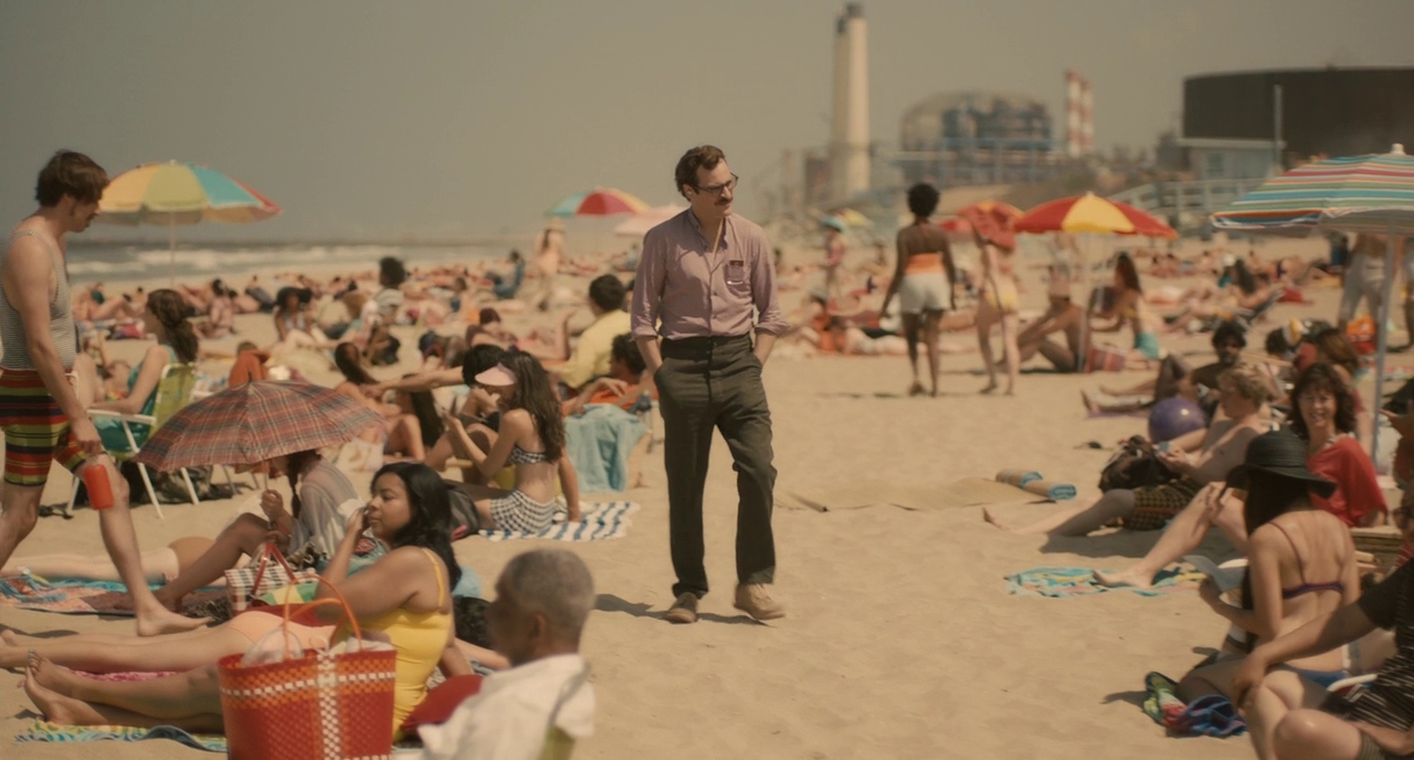
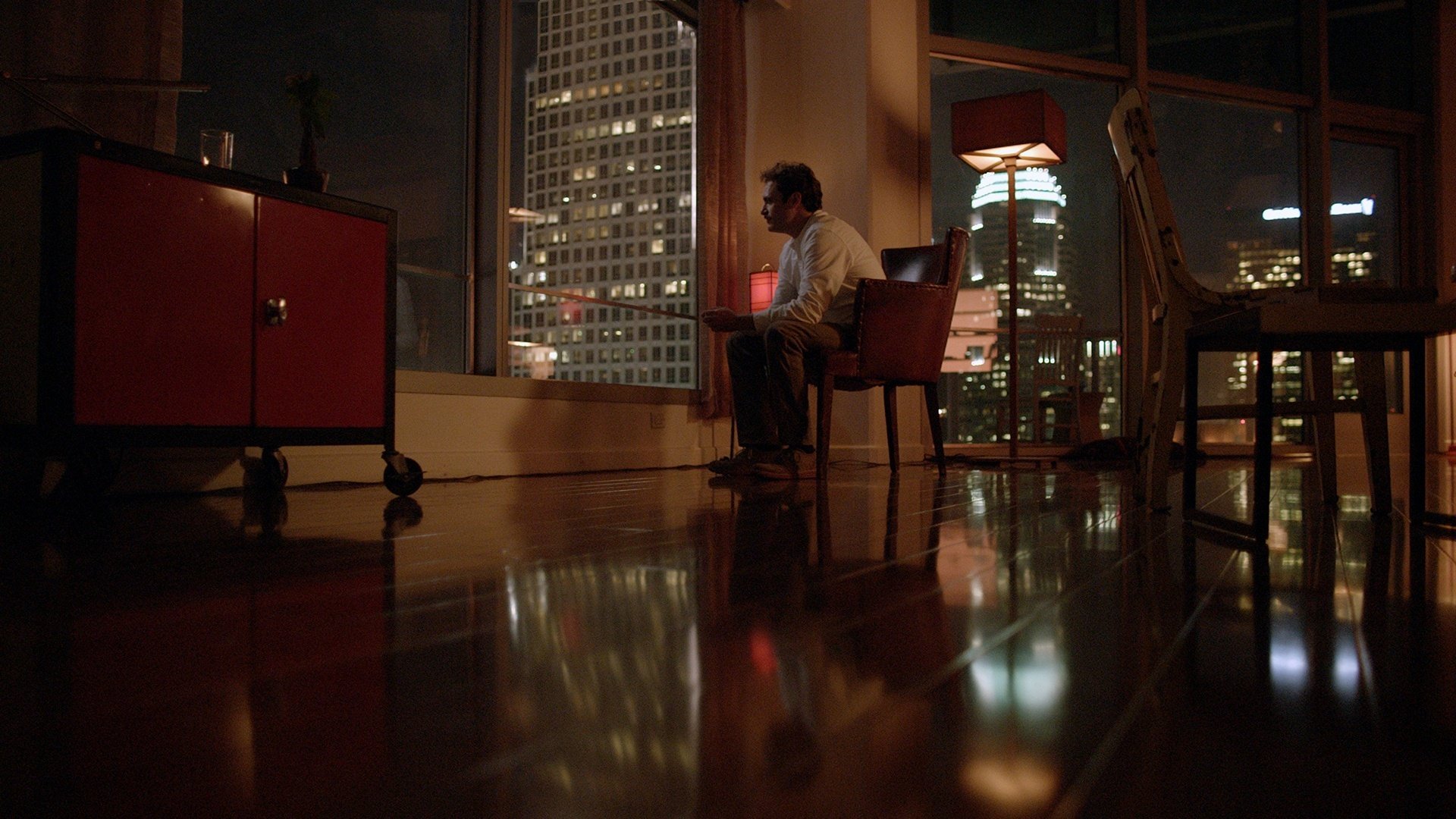
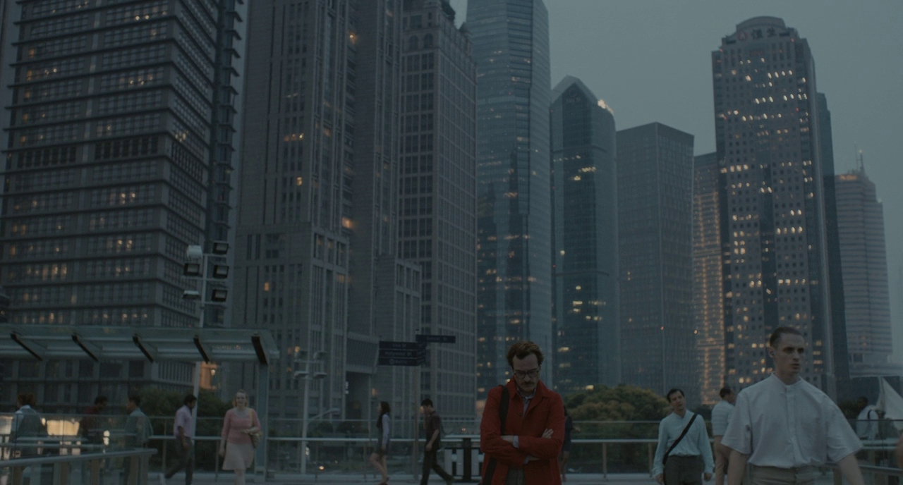
  • One of my favorite films of all time is “Her” (2013). The color palette, the soundtrack, the Neo-Los Angeles backdrop, and of course Hoyte van Hoytema’s lighting and composition.
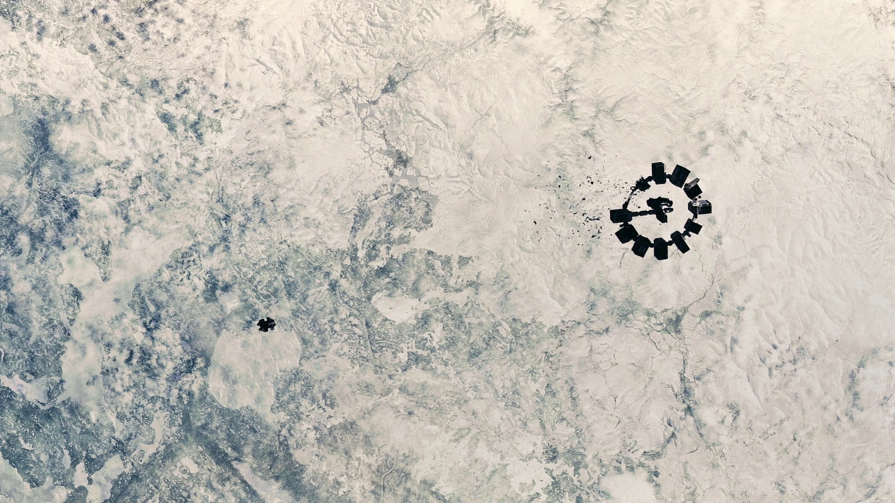
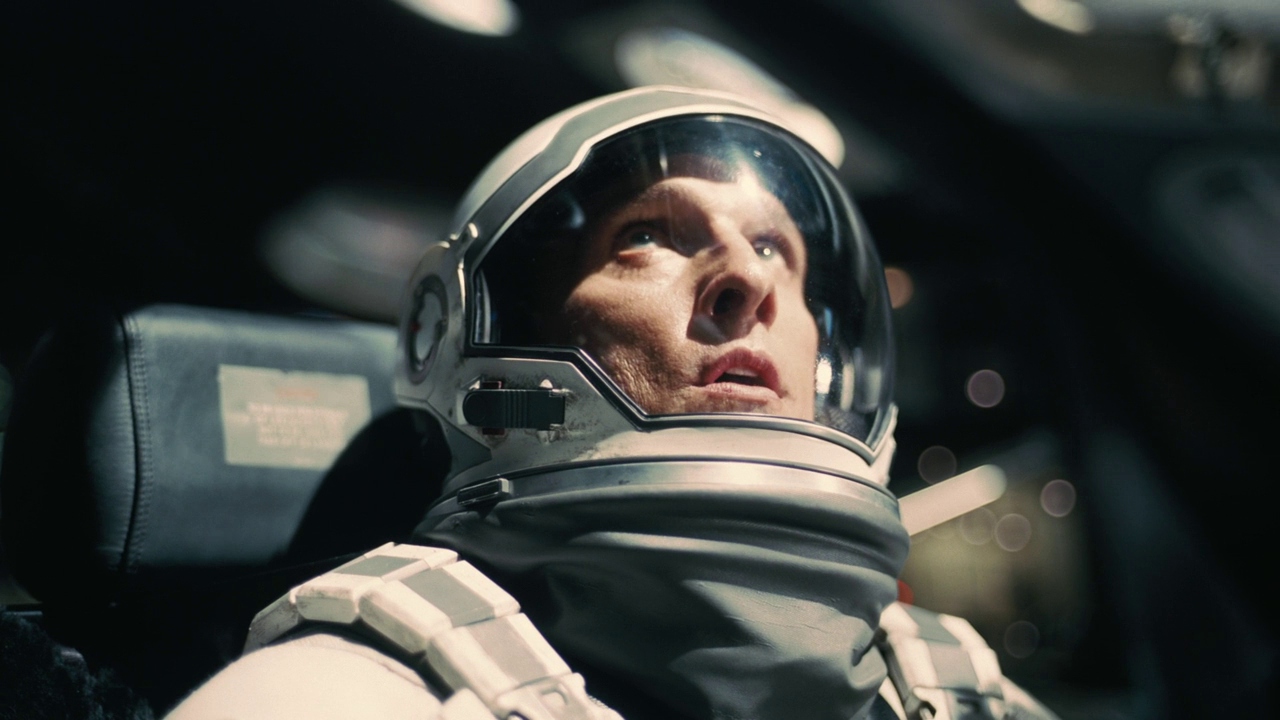
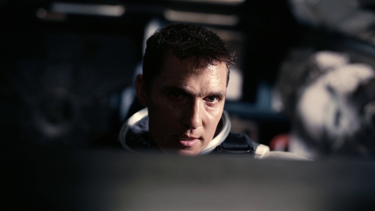
    Another one of Hoyt’s greats, Interstellar (2014), probably my favorite “space” movie of all time (tied up with 2001). The high contrast and highlights and his use of light/shadows in space. The use of practical lighting.
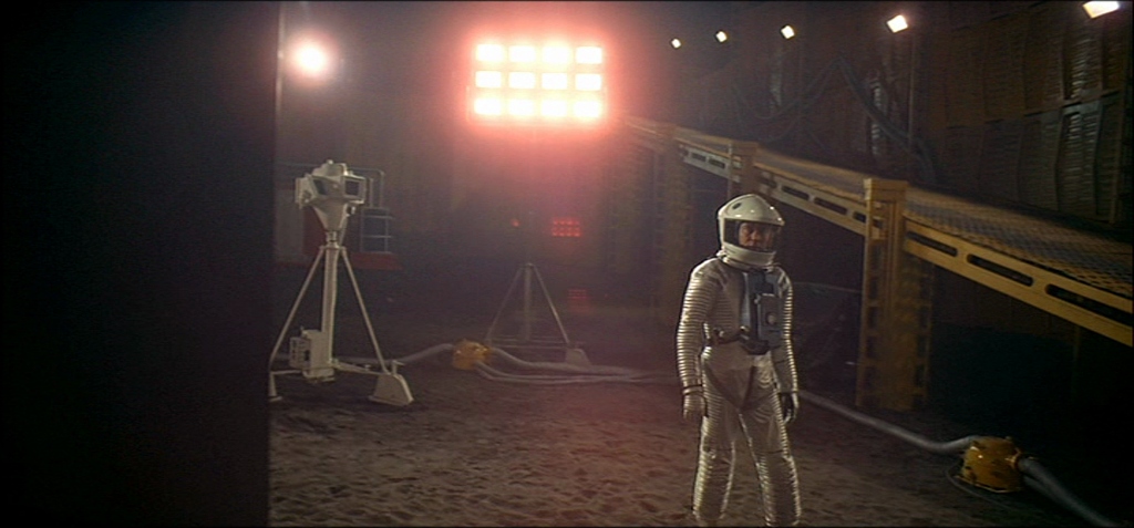
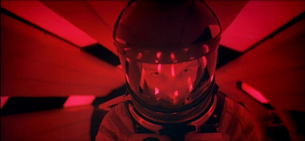
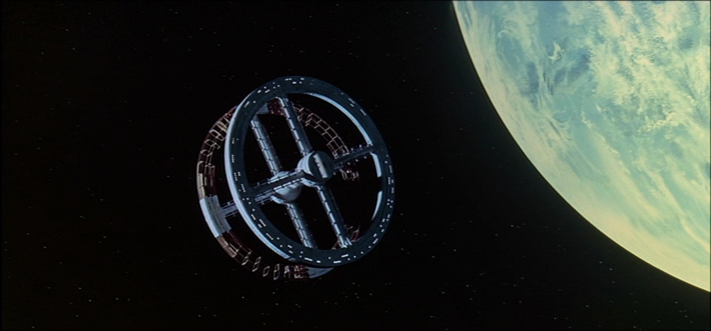
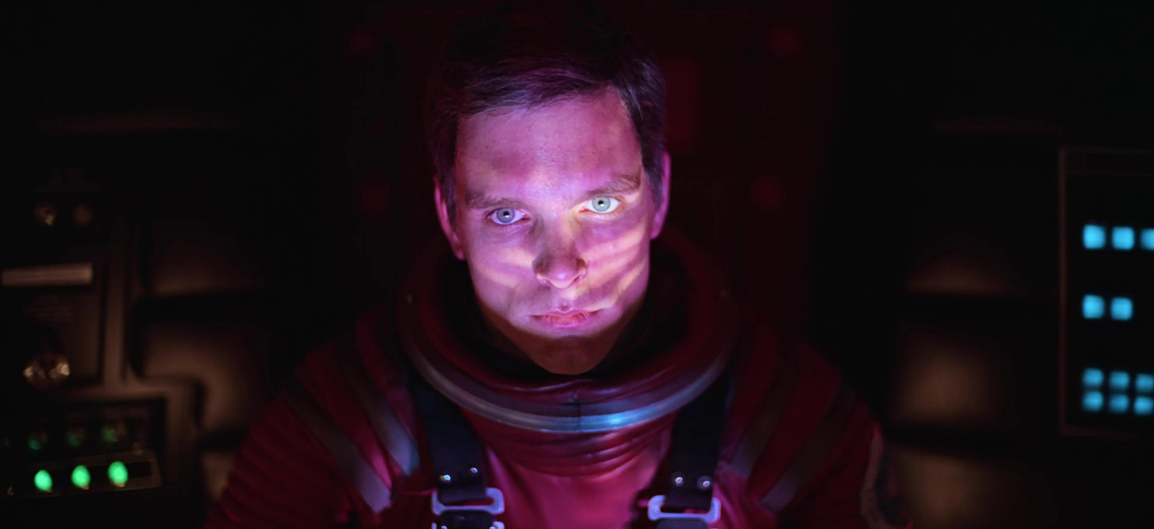
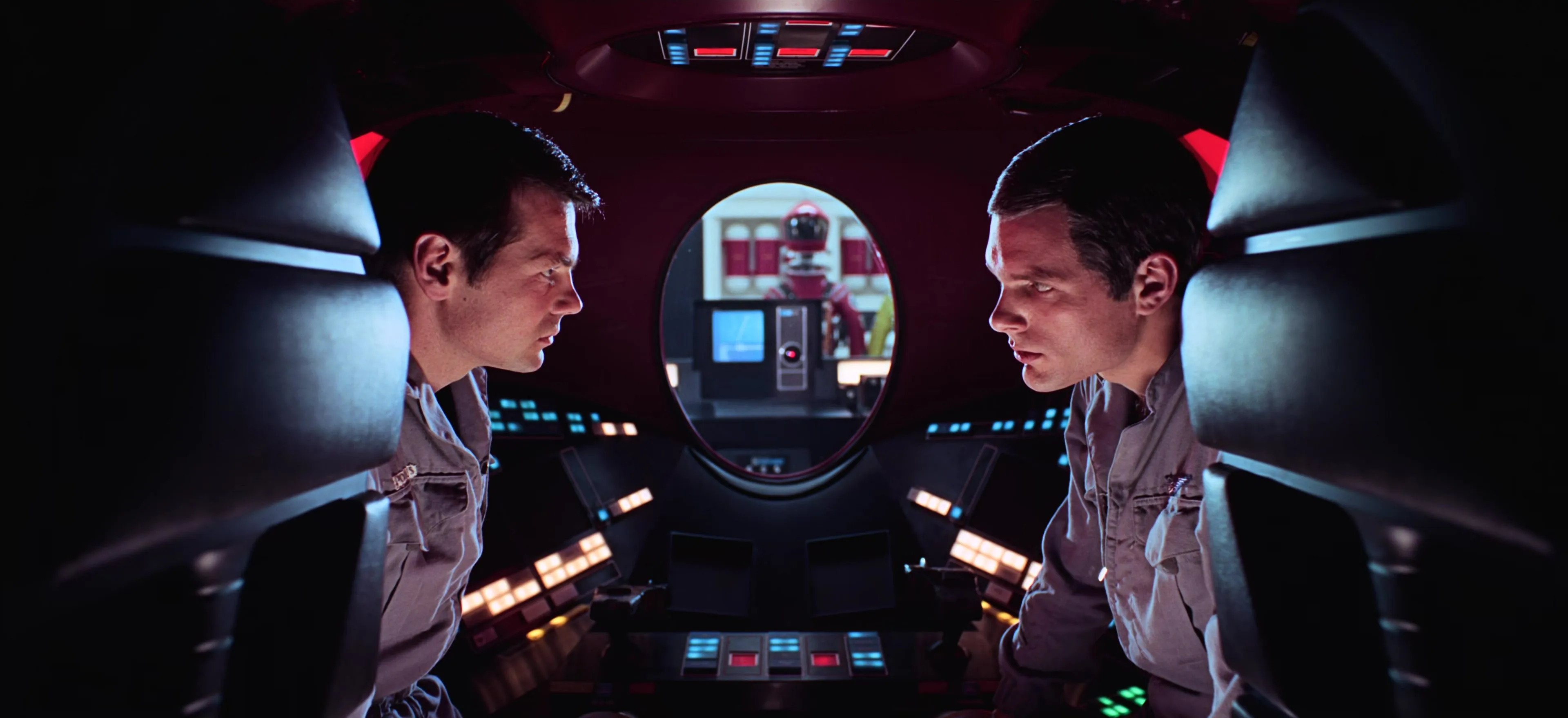
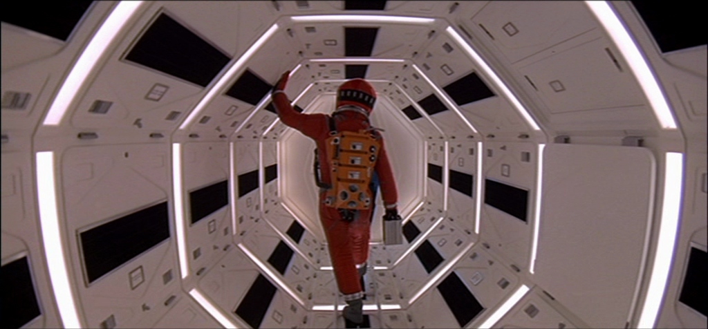
    Of course it’s hard to mention Interstellar without mentioning its predecessor, “2001: A Space Odyssey” (1968). Stanley Kubrick was so revolutionary in how he was able to capture science fiction in 1968, so well that some people actually believe he helped fake the moon landing. Geoffrey Unsworth and John Alcott created the meta for science fiction space visuals.

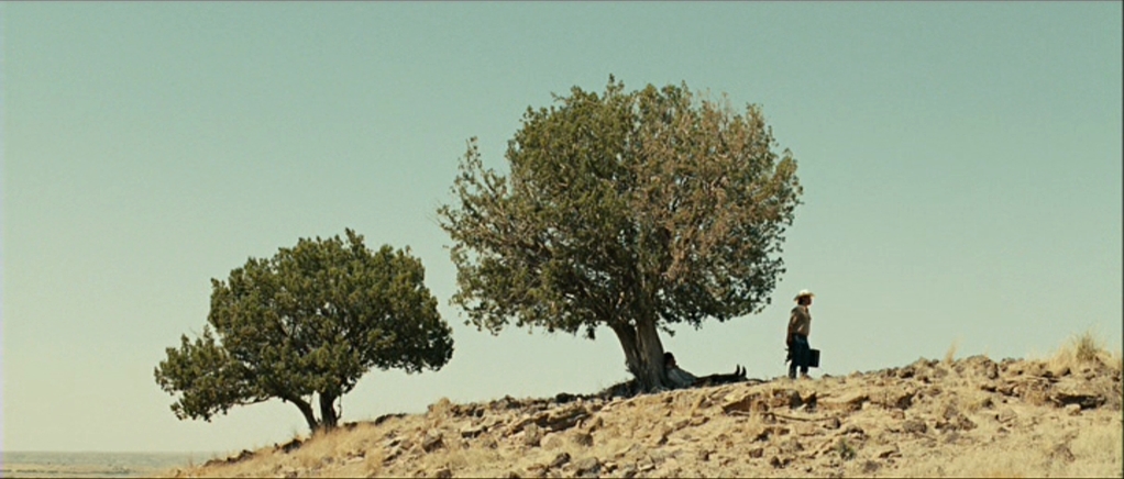
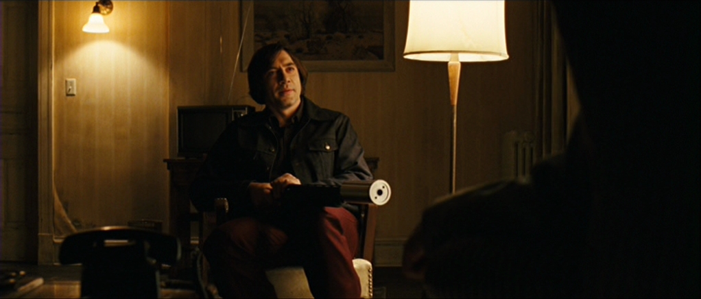
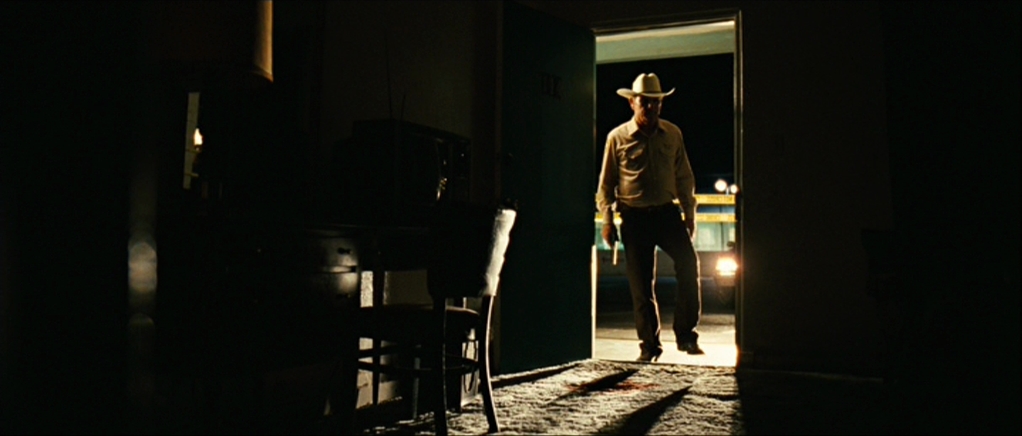
    We can’t not mention the great Roger Deakins (who I seem to almost meet every week, I missed his book signing and his appearance at CineGear). Everything he has made is top tier. An all-around great movie I love of his is “No Country For Old Men” (2007). He’s a master of lighting faces and creating a perfect balance between style and reality.
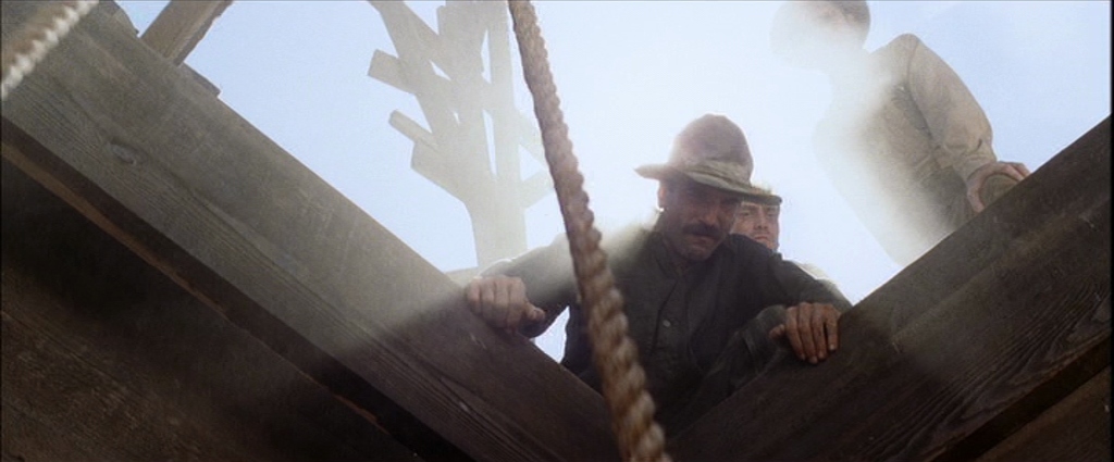
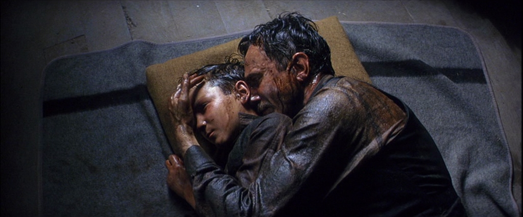
    The same year (and filmed just next door to No Country For Old Men) was “There Will Be Blood” (2007). On top of the incredible performances, writing, and directing, Robert Elswit won the Best Cinematography that year for a reason.