It’s been great 4 days here on fediverse for me. But I started to notice that there is barely any content in form of videos or gifs. Every content is just static in form is images or text. This is what I am really missing here compared to reddit. Is there any particular reason behind it?


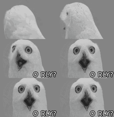
https://media.tenor.com/uC2qyrJsT6wAAAAM/oh-really-o-rly.gif
I have another cool tip for you. You can embed the graphic into your comment when you use markdown formatting. This way
becomes this:I’m on the android chrome kbin app, annnnnd i think you meant to embed that? But lol… For me it’s the literal exact same bluetext hotlink
Oh well, in Lemmy this works fine ^^
Are you using a mobile app?
Both, mobile and web app.
Since it sounds like you have auto media preview turned off, just tap that little icon to the left of the link, and you’ll see the image load below the link.
Oooooo… Yes that’s it. Thank you. That’s a good protip. I’m assuming that’s a setting that I probably turned off while trying to make the the All page be more compact.
Edit: I don’t know where that setting is. It’s not in my profile settings.
Here’s where you go to do it
My God. Multiple times I’ve been on that screen in the past. But every time, I’ll have no idea how I got there. I’ve tried to get back, but the best I had was on a magazine’s page at the very bottom.
Thank you for showing this.
My opinion? This is AWFUL design. That a second settings button is THERE is unbelievable. Maybe I’m not hip to how the fediverse exactly works, but this doesn’t feel like the right route to that stuff.