- cross-posted to:
- [email protected]
- [email protected]
- cross-posted to:
- [email protected]
- [email protected]
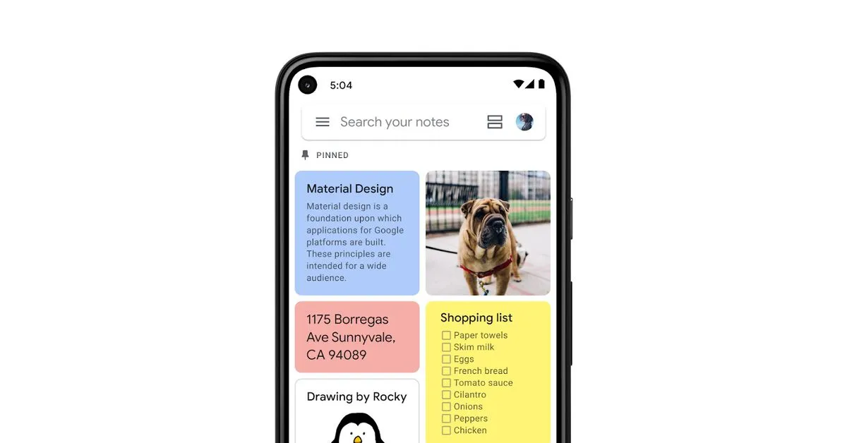
Google’s excellent and neglected note-taking app is getting some much-needed formatting options and overall love. Here’s hoping it’s not the last time.


Their last update to the home screen widget ruined the styling and usability of it. Made all the controls and notes take up a ton more space by turning them into big dumb child buttons, leaving way less room for actual content. I switched to Zoho notes.