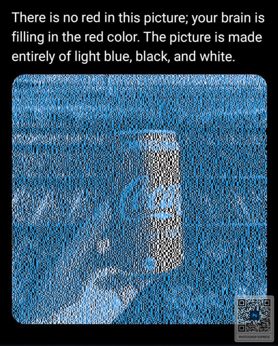
I’m also lost. Because logically it should be the white, but I see a red and white striped midsection of the train and a red and white flecked can, so I think it must be coming from the black pixels.
Why is my brain making the train stripes red? I don’t know what color they normally are, which I assumed was the mechanism behind the coke can illusion.
Because our brains interpret colours and shading relative to their surroundings. That specific blue is on the opposite side of the colour wheel from red, so that relative lack of blue can be interpreted by our brains as red.
Remember that white is all colours present, so white next to white will have more red than white next to blue.
You’d get a similar effect if you stare at a bright blue version of the can for a while and then look at a blank white page or close your eyes. The after image isn’t the same colour as the thing you were staring at, it’s the inverse of that colour.
No judgment for using the tool you used. I just always feel a need to say fuck Adobe lol. Recently got our production team fully in resolve, but unfortunately there is no suitable replacement for adobe audio enhance tool yet. Hoping resolve’s voice isolation tool can eventually supplant it.
It is when you use cova cola instead of, lolipop, santa, flag, flower or some other red object.
Here’s another example
That’s so weird. You can stare at a pixel and go “yep that’s red”. Zoom in, still red. Zoom more, BOOM IT’S BLACK!
The “red” parts are white, but yeah it’s interesting
I am confident that is not correct, but every time I zoom in to test it, my brain explodes and I can’t tell.
I’m also lost. Because logically it should be the white, but I see a red and white striped midsection of the train and a red and white flecked can, so I think it must be coming from the black pixels.
Why is my brain making the train stripes red? I don’t know what color they normally are, which I assumed was the mechanism behind the coke can illusion.
Because our brains interpret colours and shading relative to their surroundings. That specific blue is on the opposite side of the colour wheel from red, so that relative lack of blue can be interpreted by our brains as red.
Remember that white is all colours present, so white next to white will have more red than white next to blue.
You’d get a similar effect if you stare at a bright blue version of the can for a while and then look at a blank white page or close your eyes. The after image isn’t the same colour as the thing you were staring at, it’s the inverse of that colour.
Nah, it’s still colour theory. Now it’s yellow, magic.
As a video editor, fuck Adobe lol
I’m right there with you, I just downloaded the first app I thought might let me shift hue.
No judgment for using the tool you used. I just always feel a need to say fuck Adobe lol. Recently got our production team fully in resolve, but unfortunately there is no suitable replacement for adobe audio enhance tool yet. Hoping resolve’s voice isolation tool can eventually supplant it.
Jokes on you I zoomed in and out on the original and now the can appears white no matter what.