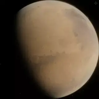
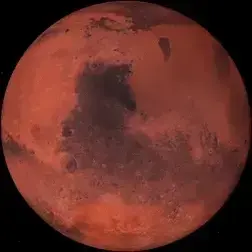
It’s Mars!

It’s a bit like the one I made for the Space Engine community, but that one is fictitious.
If anyone decides to use it, I hope you enjoy!
Oh, I’ve tested it as an icon, and even though the thumbnail image looks a bit wonky, it looks fine as an icon.


Not to downplay your work, but I was thinking Jupiter or Saturn would look epic, especially if the Saturn is wobbling a little
Saturn would be tricky because of the rings, but I’d love to do Jupiter! It might even look like a static image unless the red spot were in view, but when it appeared it would freak some people out I bet. :D …Like the statue that suddenly blinks at you!
you can do minor variations in the layers, they can amplify the effect that its spinning, excited
I’d love to increase the color saturation and contrast (even though it probably wouldn’t look as natural), but editing webp files is proving harder than making them to begin with. :(
This is amazing work
Thank you!